PONS Langenscheidt — Tackling low market share
I helped redesign a language learning app for a new target group to enhance product quality and increase in-app sales. For that, we optimized navigation, simplified the interface language, and retained problem-solving features.

Problem
Outdated design and technology that the app was based on made it unappealing and challenging to use. Besides, the existing product no longer met expectations of the new target audience, leading to poor sales and low market share.
Making learning journey more engaging for pupils
Our new target group were school students wanting to effectively memorize foreign words and succeed in vocabulary tests.
We’ve found out that with competitor apps, they were struggling to make new words stick and had to manually create vocabulary sets aligned with their school program.
The outdated look, dry language, and repetitive tasks made pupils feel bored quickly and lose motivation for studying.

My role
As the UX & UI Designer, I worked closely with the Product Manager, UI Designer, two Mobile and one Back-End Developers, and QA Engineer to test and implement possible improvements of the learning experience for students.
My job was to draw actionable insights from previous market & user research to understand why school students prefer competitor products to our app and how we can differentiate from the rest.
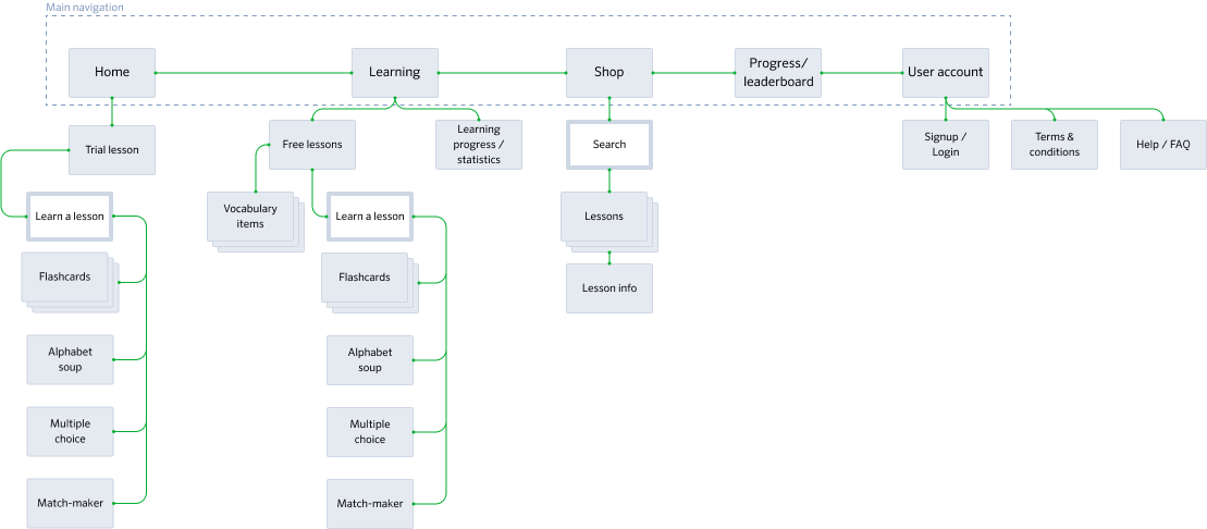
With the help of our users, I analyzed and optimized the information architecture. Two major user journeys helped me inform the whole concept and interactions with the app.


Navigating a tight budget for our MVP
Regardless of the pandemic-related uncertainty, our project was still given a go-ahead, though with a smaller budget planned for mobile development. We had to implement in such increments that would make the app usable and useful even with the minimum set of functions.
Development capacities were tight, so we focused on functions that would be of value to our users. We also planned all nice-to-haves months ahead.

OTHER CASE STUDIES
Improving information findability on publich health insurance website.
UX analysis, B2C, information architecture, card sorting, sitemap, wireframing.
Addressing inconsistent donations on NGO's website.
Website redesign, UX design, desk research, visual branding.
Solving low customer adoption in insurtech SaaS product.
Product design, B2B2C, UX research, prototyping, testing, design system.