mkk — Improving information findability
I’ve analyzed information architecture of the health insurance website and planned incremental improvements to optimize information findability and membership conversion.

Problem
Due to bad content organization, people struggle to find relevant information and accomplish common tasks on the website. That causes higher customer service costs and impairs the membership conversion rate.
Empowering customers with self-service
Company has over 500.000 members of different age, occupation, health state. On the website, they search for relevant information and can apply for cost reimbursement. The website also allows people to apply for the insurance membership online.
Talking to the customer service, I've discovered that people prefer calling the hotline when they fail to find what they need. Some agents even had to walk customers through the website by phone.
In a deeper analysis, I identified several issues of information findability (i.g. misplaced content, poor search results) that were frustrating people and making them dial the hotline.

My role
I was responsible for the UX analysis of the current website and redesign planning. During content audit I collaborated with the content team. Together we defined structural improvements for the main elements of our content system.
Along with a fellow designer, we’ve designed components, blocks, and pages to support the structural changes of the website.
A technical product owner and external front-end developers took part in all design-related meetings to make sure everyone understands and agrees to where we are heading to, why and how.
Improvements regardless of frontend bottleneck
Our front-end capacities have been limited for several months. So we decided to start with improvements that didn’t require design implementation. Such minimal changes would also help smoothen the redesign backlash, should it ever come to that.
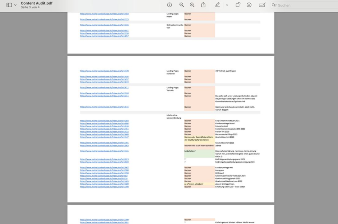
- I've audited the content to understand which content is strong and vital for mkk and its audience, which content is important but needs rework, and which content could be deleted.

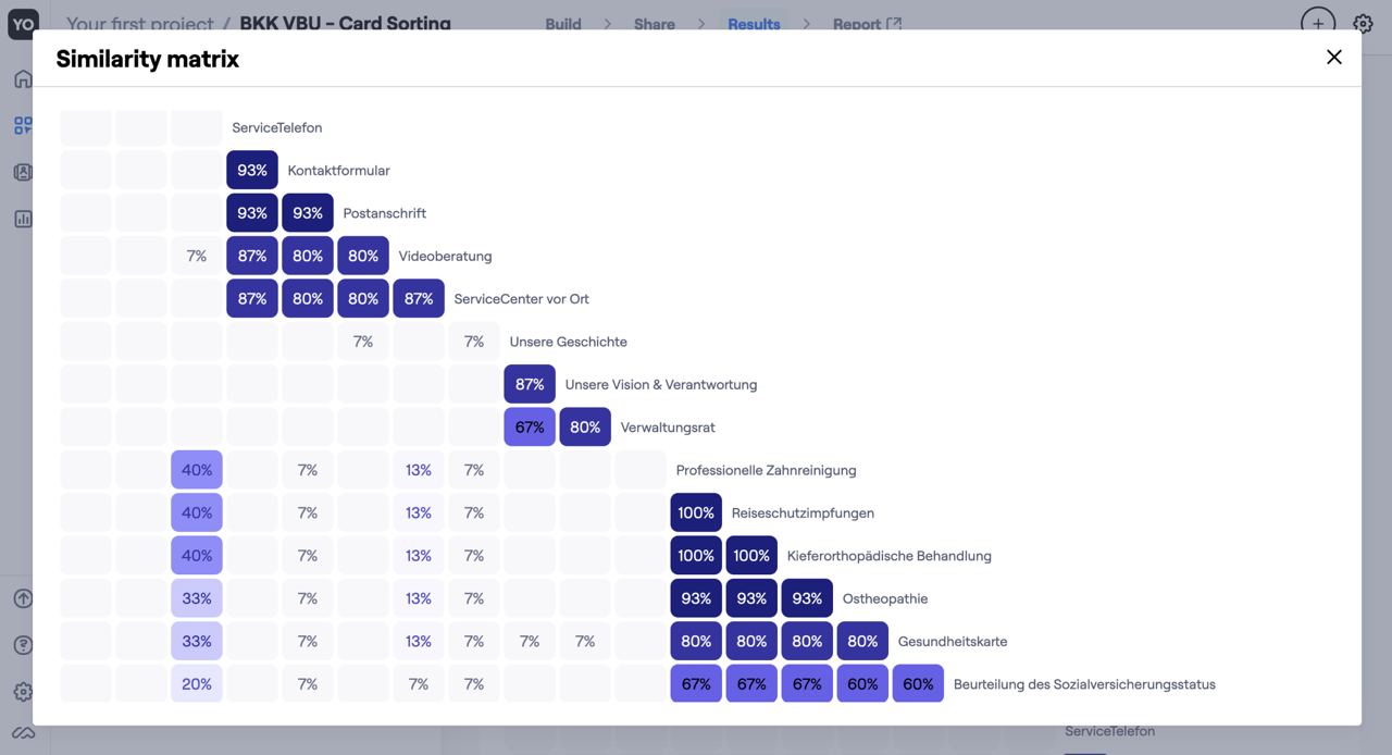
2. Conducted card sorting to see if the current structure makes sense to our customers. It did, except for 2 categories that had to be placed elsewhere.

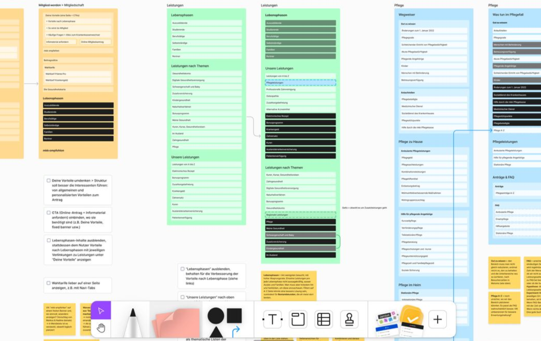
3. Reorganized good, high-value content based on unique visits (highest to lowest). That way users should spend less time scanning, before they notice relevant sections in the menu, especially for people who use screen readers.
Proposed new sitemap based on learnings of the analysis and card sorting.

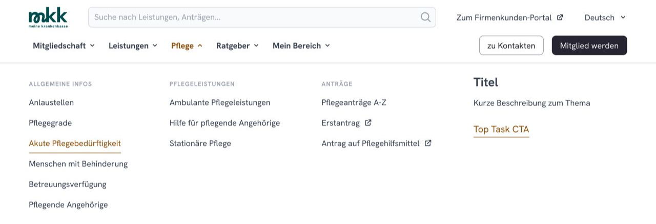
4. Designed menu and footer including all recommended changes.


This is how it compares to the current navigation.

5. Planned further work together with content team, designer and product owner. Defined metrics to track the impact of IA changes.
What's next
- remove and reorganize content in the CMS following the new sitemap
- support developers during implementation, test based on need
- measure impact of changes within time and improve accordingly
- plan further content improvements (e.g. membership conversion)
OTHER CASE STUDIES
Solving low customer adoption in insurtech SaaS product.
Product design, B2B2C, UX research, prototyping, testing, design system.
Tackling low market share of a mobile learning app.
UX Design, B2C, market research, desk research, information architecture, interaction design.
Addressing inconsistent donations on NGO's website.
Website redesign, UX design, desk research, visual branding.